Icon Design Principles
Here are rules that should be followed to keep quality and consistency when making icons for Lucide.
Summary of the rules we have
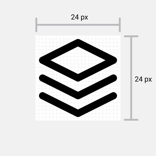
- Icons must be designed on a 24 by 24 pixels canvas.
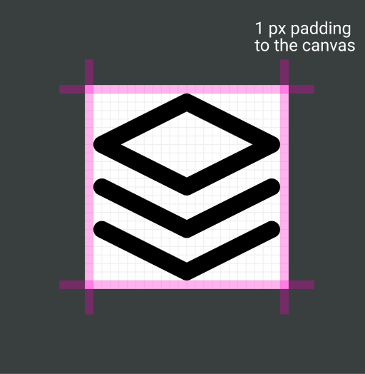
- Icons must have at least 1 pixel padding within the canvas.
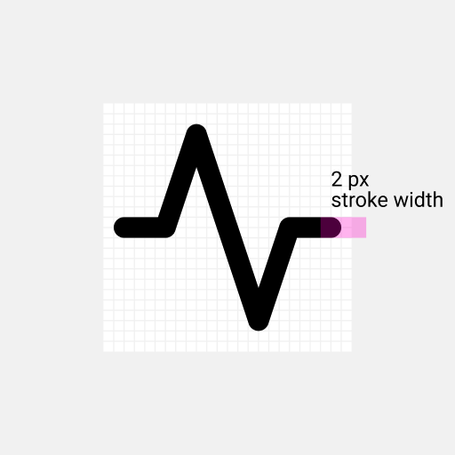
- Icons must have a stroke width of 2 pixels.
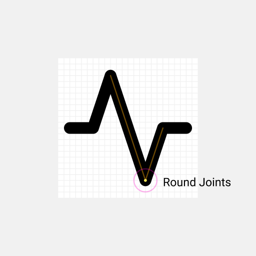
- Icons must use round joins.
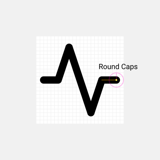
- Icons must use round caps.
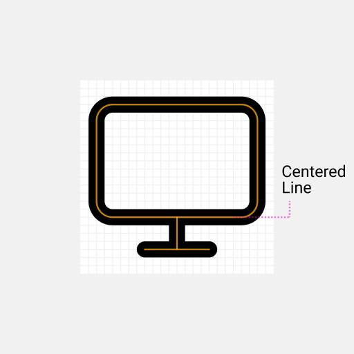
- Icons must use centered strokes.
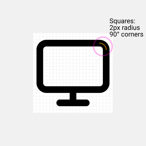
- Shapes (such as rectangles) in icons must have border radius of 2 pixels.
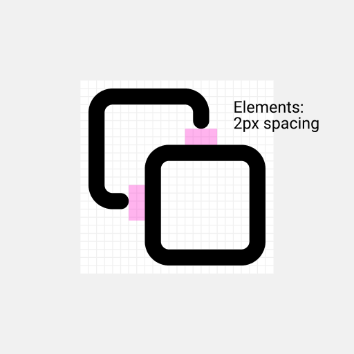
- Distinct elements must have 2 pixels of spacing between each other.
The Rules Visualized
1. Icons must be designed on a 24 by 24 pixels canvas.
2. Icons must have at least 1 pixel padding within the canvas.
3. Icons must have a stroke width of 2 pixels.
4. Icons must use round joins.
5. Icons must use round caps.
6. Icons must use centered strokes.
7. Shapes (such as squares) in icons must have border radius of 2 pixels.
8. Distinct elements must have 2 pixels of spacing between each other.
Code Conventions
Before an icon is added to the library, we like to have readable and optimized svg code.
Global Attributes
For each icon these attributes are applied, corresponding to the above rules.
<svgxmlns="http://www.w3.org/2000/svg"width="24"height="24"viewBox="0 0 24 24"fill="none"stroke="currentColor"stroke-width="2"stroke-linecap="round"stroke-linejoin="round"><!-- SVGElements --></svg>
Minify paths
Code of paths can get really big. To reduce file size we like to minify the code. We recommend to use the SVGOMG to minify paths.